Most Instagrammable places in the Norwegian Fjords
Read more about our incredible destinations
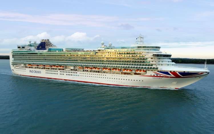
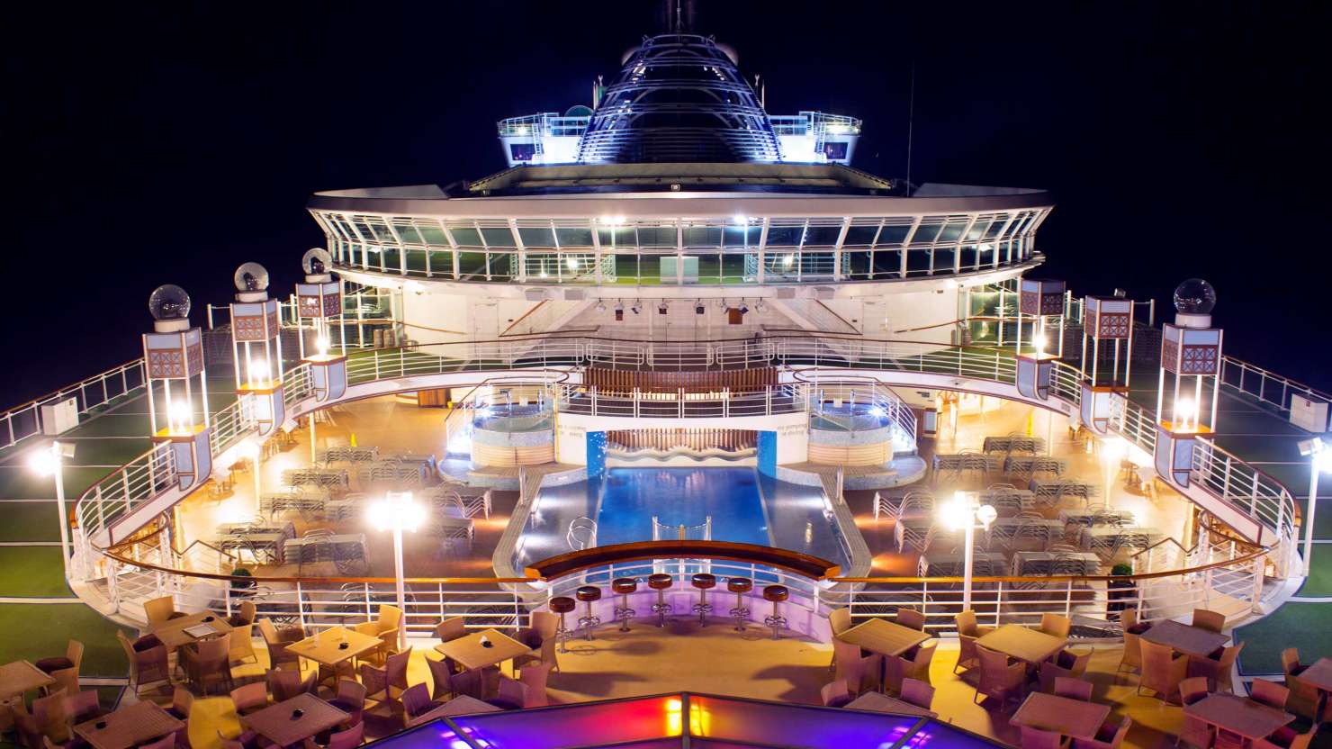
It’s Ventura’s turn for a refit. Our fun, family-friendly all-rounder will soon be treated to stylish design updates across cabins, restaurants, bars and beyond. Nicola Preece from AD Associates, the designers behind the refit, gives us an exclusive sneak peek.
We’re always investing in our fleet and making sure our ships are in tip-top shape with design updates that keep them looking fresh. This year marks Ventura’s turn for a refit, which we’ve placed in the capable hands of London-based designers AD Associates. We spoke to Nicola Preece, Design Director, Marine & Hospitality at AD Associates, about the inspiration behind the changes and what to look out for next time you’re on board.
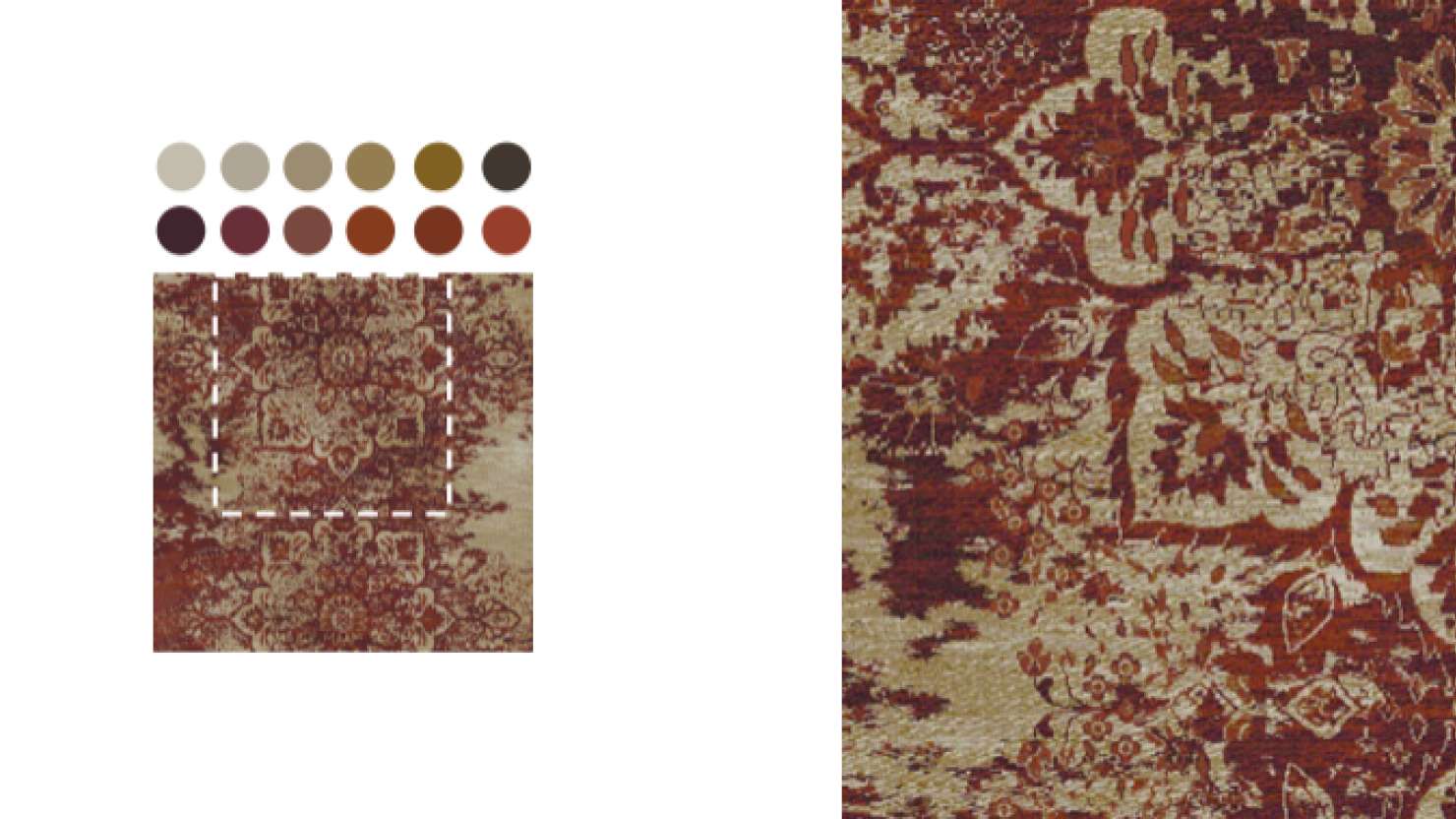
A. The transformation of Ventura centres on a thoughtful reimagining of surface and texture rather than structural interventions. The most significant change – and the one that will resonate most deeply with guests – is the comprehensive renewal of carpets, floor finishes and textiles. The carpets are narrative devices and form the largest uninterrupted canvas on a ship that guests can physically connect with throughout their journey.
By introducing patterns and tonal depth to these textiles, we’ve fundamentally shifted the atmospheric quality of each space. The new designs create visual rhythm and wayfinding cues that guests may not consciously notice but will certainly feel – a subtle confidence about where they are and where they’re going.
The soft furnishings selections work in tandem with these floor treatments to tighten the individual venue’s identity, creating a cohesive sense of destination within the ship itself.
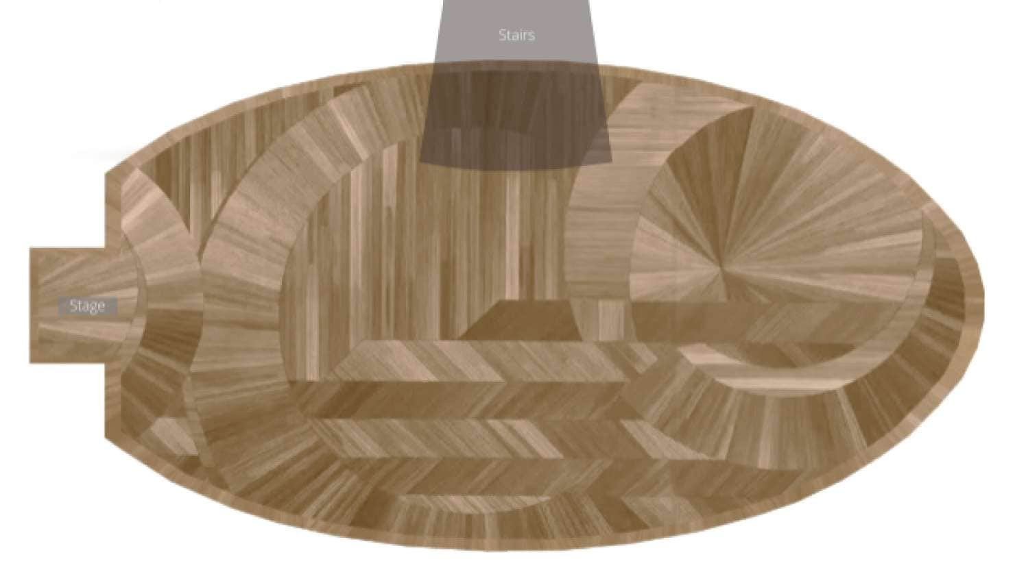
A. The design draws inspiration from traditional marquetry – that exquisite art of inlaying contrasting materials to create pattern and depth. We’ve translated this three-dimensional craft into a two-dimensional expression through timber planks. This approach is deliberately faithful to Ventura's original aesthetic DNA while being thoroughly reimagined for contemporary sensibilities. The tonal palette creates visual movement within bold geometry.
What we hope guests feel is an immediate sense of welcome and confident, comfortable elegance. That first moment should communicate: ‘You've arrived somewhere special’.
A. The inspiration came from identifying what made Ventura feel like Ventura – those essential qualities that loyal guests would miss if removed. We brought in contemporary elements through tonal sophistication, replacing high-contrast moments with nuanced gradations. Patterns remain, but they’re more intricate, more layered, the colour palette has been edited to create breathing room, allowing the existing elements that remain to feel harmonious.
A. The key is establishing a clear design grammar – a set of visual rules that can be interpreted differently in each space while still speaking the same underlying language. For Ventura, our grammar includes consistent approaches to scale, tonal relationships, and the balance between pattern and calm. But within that framework, each venue gets its own accent:
Differentiation creates memorable moments and helps with intuitive navigation; harmony creates comfort and cohesion. Both are essential.
A. The most enjoyable aspect wasn’t necessarily about individual venues, but rather the process of building distinct narratives for each space – narratives that then became the foundation for every design decision that followed. What made this particularly rewarding was how each venue demanded its own story research and cultural excavation. By building these rich narratives first – really understanding the cultural, historical and sensory essence of each space – made the subsequent design work feel inevitable.
The narrative becomes a framework that guides your hand and helps inform the micro-decisions with confidence and reasoning.
A. Guests are the invisible collaborators throughout the entire process. While they’re not physically present during design development, they’re represented in every decision through data, feedback, observation and empathy. More philosophically, guests participate by being human. Good design for cruise ships means understanding fundamental human needs: orientation and wayfinding, variety without chaos, excitement balanced with refuge, spaces that accommodate both social connection and quiet retreat. Our job is to observe human nature carefully and design in service of it.
A. Throughout the ship, notice how patterns change scale between spaces – bold enough to create presence in large venues, refined enough for intimacy in smaller settings. Observe how the carpet patterns create subtle pathways, guiding movement without obvious directional cues.
A. There’s the unique challenge of scale: creating intimacy in large spaces, variety across vast square footage, and coherence across multiple decks and venues. Designing spaces that all need to work independently while forming a unified whole.
The most rewarding aspect is the longevity of impact. Cruise ship spaces are lived in intensively for a week or more. Guests really notice the details. They develop favourite spots. They form genuine relationships with the spaces. That emotional connection is what makes this work meaningful.
of
Don’t miss out! Sign up for latest news, offers and competitions from P&O Cruises.